A product’s value is directly proportional to the experience it generates for its users. Made up of hundreds of small components, the user experience or UX is often the trickiest part to perfect for any organisation. It takes careful analysis and countless experiments just to get it right. Then, how can someone harness its powers to maximise the output? That exactly was the topic of the third masterclass of The Maker Circle, a series of masterclasses by veteran product leaders hosted by Inc42 Plus as a prelude to The Makers Summit 2021. Sharing his vast experience and knowledge, Saptarshi Prakash, senior product design manager at food delivery giant Swiggy, explained how to curate a successful product, using an immersive user experience.
In the first masterclass of the series, product leader and mentor Shesh Vasudevamurthy had explained strategies needed by product managers to excel in the technology driven development space. The second masterclass saw Sruthi Sivakumar talk about the framework of redesigning a product and nuances of fixing the flaws in the design.
Here are the key takeaways from Prakash’s masterclass session.
Register For The Makers Summit
Seemingly Unimportant Things
Prakash began the session by sharing his observations on how users relate with a product. Sometimes, the things which make a user associate with a product are not even an intended feature. Taking an example from his own life, Prakash shared the story of a nail-clipper his brother bought for the family. An expensive and very efficient product, the nail-clipper outperformed the older one in every aspect, except it didn’t make the clicking sound while clipping nails. Yet, his mom wouldn’t use the product because the lack of clicking sound made it feel unnatural to use.
This highlights how people tend to associate a product with certain things and end up habituating with it. Prakash calls it syncing with people’s natural frequency.
“This association is natural and it is ingrained inside each one of us. When you use a product and you get the same natural feedback, it feels good. As a creator, that is your aim. If you can create a product which fits in with the user’s natural frequency, you win,” Prakash said.

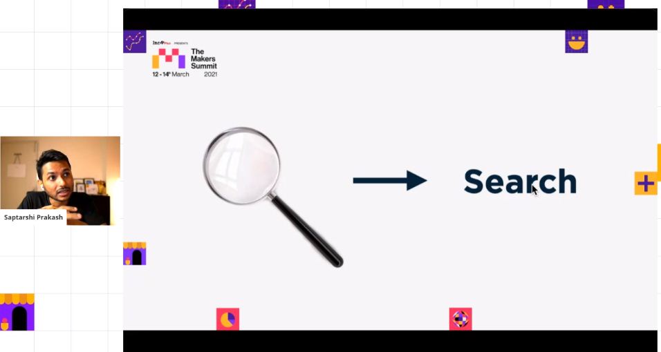
Similarly, he took another example of the magnifying glass. Looking at a magnifying glass just by itself means nothing more than a magnifying glass. However, seen as an icon, it is one of the most recognisable icons which people instinctively associate with the search functionality. It has become universal ever since Google started using it. However, he opines that it is not how people use a magnifying glass in real life, and so, it is not a part of the natural frequency. On the contrary, he explained an instance when his designer team was conducting some experiments in north eastern India’s villages and people, after seeing that icon, thought it to be a badminton racket.
Prakash explained that sometimes, these associations are man-made and they pre-condition us to make it feel like they are part of our natural frequency. According to him, it is the ultimate goal of every creator to build a user experience element that surpasses the natural and takes over as people’s association.
Register For The Makers Summit
Giving The User Without Being Asked
Recollecting a quote from his college days, Prakash said, “I read this quote which said — If you bring me coffee without having to ask, then, I love you.”

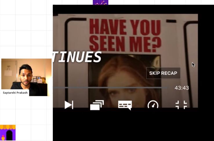
And on that note of understanding users’ needs before they could ask for it, Prakash cited the example of Netflix. The popular OTT platform which is dedicated to movies and TV shows has credits and recaps before the movie or show begins. Most people prefer to skip past it on all platforms and use the scroll bar to skip, after a few unsuccessful attempts of going back and forth. Netflix saw that and added a little button at the bottom which allows a user to perfectly skip through recaps and intros and allows them to begin where they would prefer to watch their shows.
Citing yet another example of addition of visual cues, Prakash pointed at the ‘Format’ option in Google Docs. In there lies the option to Capitalise the letters, where one can choose the text cases they would like to write in. To turn it to all uppercase, the menu option simply reads ‘UPPERCASE’ in all capitals; for lowercase, all the letters are in ‘lowercase’. Similarly, with the titlecase, the menu option is written as ‘Title Case’, with the first letter of both words in capitals. The way they are represented, the user would understand what the option does, even if he isn’t aware what uppercase or lowercase means. This little visual cue wasn’t necessary but it adds another layer of convenience to the user, explained Prakash.
Using the examples, Prakash highlights the need to take preemptive measures to really make an impact with the user experience. The user wants his life to be easier with the use of the product and if a product has a scope of providing a better user experience, then the team must implement it before the users realise that there’s a better option with someone else. Because, as Saptarshi explains, once the user feels the lack of a feature and it hinders his experience of the product, then implementing the feature is a rectifying measure. At that point the effort to reward ratio goes down and the opportunity to make an impact by giving the user something they didn’t even know they wanted, is lost forever.
Register For The Makers Summit
The Laws Of Habituation
Adding further details to what constitutes a good UX, Prakash gave the example of the popular dating app Tinder. The platform has created a visual animation called ‘swipe’, which requires the user to flick his/her finger to the right to match with another user or to their left to keep getting new possible matches. Prakash pointed out that Tinder’s ‘swipe feature’ also follows the natural frequency and mimics our natural instinct to swipe through a deck of cards. By adding this little touch, the users are able to familiarise themselves with the platform naturally and it helps the engagement rate. The feature has gotten so popular that now every new platform incorporates it by default.

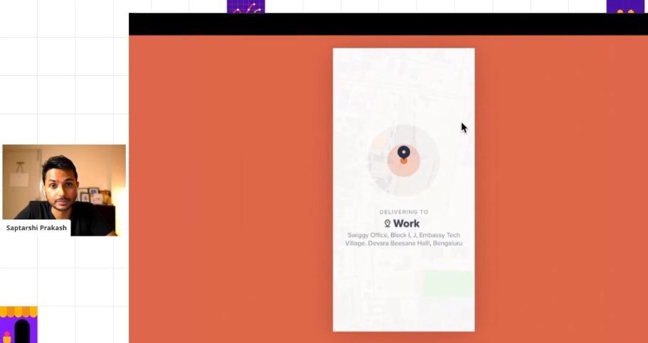
In the masterclass, Prakash threw light on a challenge his team faced at Swiggy in the early days of their product journey. Prakash noticed that a lot of users were mistakenly placing an order at the wrong address. The problem arose as the users had their GPS turned off, and selected their previous order location by default, even if they were not at that location. This caused Swiggy to lose revenue due to cancelled orders.
As a solution to the problem, Prakash decided to add a little animation on the app, which briefly shows the user’s location when one opens the app, before setting it on the top of the screen. Prakash stated that this little change, without making any major overhaul, solved the problem.
A user’s experience becomes good only when it follows the natural frequency and habits of a person. According to Prakash, it is incredibly important to understand what these are and build the product leveraging that knowledge to maximise on the impact.
Giving reference to the famous book Atomic Habit by James Clear, Prakash broke down ‘habit’ into four different steps: cue, craving, response and reward. Prakash said that habit is always preceded by these four steps. To influence a user and to create the maximum impact, the product has to mimic either the cue or the reward. The beginning and the end of the chain is where a stimulation primes a person to repeat a behavior. Cue generates familiarity which makes it easy to step into a habit, and reward ensures that the person has a positive experience for following up with the behavior. To ensure a product is successful, these are the signals one has to focus on.
Bringing an end to a very enthralling session, Prakash asked the audience to treat the users as their family members. He emphasised that only when they try to understand the users and their concerns from a humane perspective, can they find solutions that leave lasting impact.
He says, “Don’t just know your user; know the feelings of your user. Think of them as a human with feelings and emotional desires. Try to think about what makes them happy, what makes them sad, and when you take a step in their shoes, how would you observe the product you have created.”
Register For The Makers Summit
The post Here’s Your Ultimate Guide To Using Micro-Experiences To 10X Your UX appeared first on Inc42 Media.
0 Comments